

Introduction:
Graphic design is a powerful form of visual communication that allows designers to express ideas, emotions, and messages through typography, colors, images, shapes, and layouts. From bold experimental posters to clean corporate branding, different graphic design styles help businesses, artists, and creators communicate with their audiences in distinctive ways.
Expressive graphic design focuses on communicating a strong idea, feeling, or personality through visual elements. It can be colorful, minimal, unconventional, complex, or deliberately experimental. The most effective approach depends on the message, the audience, and the purpose of the project.
Understanding different graphic design styles helps you make informed creative decisions, develop original concepts, and create designs that are both visually attractive and meaningful. In this guide, we explore expressive design, constructivism, deconstruction, complementary styles, creative layouts, and practical ways to develop your own visual identity.
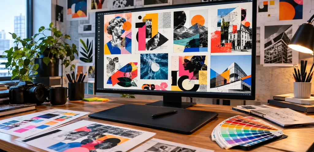
Table of Contents
What Is Expressive Graphic Design?
Expressive graphic design uses visual elements to communicate personality, emotion, energy, or a distinctive point of view. Instead of focusing only on presenting information, it considers how the audience should feel and what impression the design should leave.
Designers may use oversized typography, dramatic contrasts, unusual compositions, hand-drawn illustrations, textured backgrounds, or unexpected color combinations to create a particular atmosphere.
For example, a music festival poster might use large experimental lettering, vivid colors, and overlapping shapes to communicate excitement. A cultural exhibition might use traditional patterns, authentic photography, and expressive typography to reflect its identity.
Expressive design does not mean adding as many effects as possible. Every element should contribute to the intended message.
Key Characteristics of Expressive Design
- Strong personality: The design communicates a recognizable tone or visual identity.
- Emotional impact: Colors, images, and composition help create a feeling.
- Creative experimentation: Designers explore different arrangements, styles, and visual techniques.
- Distinctive typography: Lettering can become a major visual feature.
- Intentional contrast: Differences in scale, color, or texture attract attention.
- Meaningful composition: The placement of elements supports the central idea.
Expressive design can be used for branding, editorial projects, advertising, music artwork, posters, digital campaigns, and social media graphics.
Popular Graphic Design Styles to Explore
Graphic design includes many styles, each with its own visual characteristics and communication strengths. Learning how these styles work can help you select an appropriate direction for a project or combine different approaches to create something original.
1. Constructivism Graphic Design Style
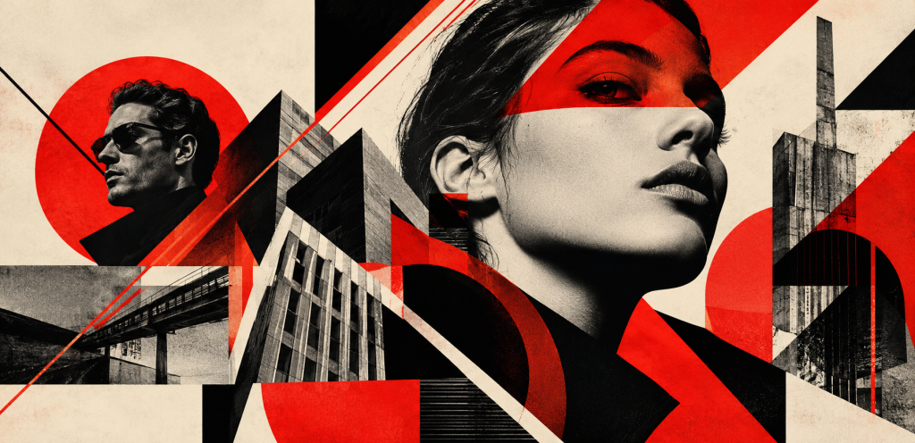
Constructivism is an influential design movement associated with early twentieth-century Russian art. It emphasized geometric forms, strong compositions, industrial imagery, and visual communication connected to modern society.
The constructivism graphic design style often features bold typography, diagonal lines, circles, triangles, limited color palettes, and dynamic arrangements.
Common characteristics include:
- Geometric shapes and structured compositions.
- Strong contrasts, often involving red, black, and white.
- Bold sans-serif typography.
- Diagonal layouts that create movement.
- Photographic elements combined with geometric graphics.
Constructivist principles can be useful for editorial posters, cultural campaigns, event graphics, and brands seeking a bold, industrial, or historically inspired visual identity.
To use this style effectively, organize the design around a clear focal point. Strong geometric compositions should help communicate the message rather than make the layout difficult to understand.
2. Deconstruction Graphic Design
Deconstruction graphic design challenges traditional ideas about order, alignment, readability, and visual structure. Instead of following a conventional grid, designers may break apart familiar layouts and rearrange their elements.
This approach can include overlapping text, fragmented images, unusual spacing, irregular grids, cropped typography, and unexpected combinations of visual components.
Deconstruction and graphic design are often discussed in connection with experimental typography and postmodern visual communication. The approach questions established conventions and encourages viewers to interpret the composition more actively.
For example, an experimental magazine cover might use partially cropped letters, layered photographs, and asymmetrical placement to create tension and visual interest.
However, deconstruction should still have a purpose. If every element competes for attention, the design may become confusing. Consider preserving essential information, such as dates, headlines, and calls to action, when readability is important.
3. Clean Graphic Design
Clean graphic design emphasizes simplicity, clarity, balance, and organization. It often uses generous white space, consistent alignment, limited colors, and readable typography.
This style works particularly well for corporate websites, professional presentations, business branding, product pages, and informational graphics.
A clean design usually includes:
- A clear visual hierarchy.
- Consistent spacing and alignment.
- A limited and coordinated color palette.
- Readable typography.
- Only the images and elements needed to communicate the message.
Clean design does not have to be plain or boring. Careful typography, thoughtful spacing, distinctive photography, and subtle visual details can make a simple composition memorable.
4. Complex Graphic Design
Complex graphic design uses multiple visual elements, layers, textures, patterns, illustrations, or information groups to create a detailed composition.
It may be appropriate for editorial artwork, detailed infographics, music posters, game artwork, and visual storytelling projects.
A complex design can be visually rich, but it still needs structure. Use grouping, contrast, scale, and visual hierarchy to help viewers understand where to look first.
For example, an infographic containing several data points can remain readable when each section has a clear heading, related information is grouped together, and the most important findings are highlighted.
The key is to make complexity intentional. More elements do not automatically produce a better design.
5. Critical Graphic Design
Critical graphic design explores social, cultural, political, environmental, or ethical questions through visual communication. Rather than simply promoting a product or service, it may encourage audiences to question assumptions, reconsider familiar ideas, or examine an issue from another perspective.
Designers can use symbolism, contrast, typography, imagery, and visual irony to communicate a critical viewpoint.
Examples include public awareness posters, environmental campaigns, conceptual publications, and exhibition graphics that address social issues.
Because the subject matter can be sensitive, designers should research the topic carefully, represent people and communities responsibly, and ensure that the visuals support the intended message.
6. Authentic Graphic Design
Authentic graphic design reflects a brand, individual, or organization in a way that feels consistent with its real identity and values.
Authenticity can be communicated through original photography, meaningful stories, distinctive typography, culturally relevant visual references, and a consistent brand voice.
For a small business, this might mean using real product photographs, genuine customer stories, and a color palette connected to its identity rather than copying the latest design trend.
Authentic design does not require a rough or handmade appearance. A polished corporate identity can also feel authentic when it accurately represents the organization behind it.

Blending Different Graphic Design Styles
Designers do not always need to follow a single style. A blend graphic design approach combines selected characteristics from different visual traditions to create a distinctive result.
For example, you could combine the simplicity of minimalist design with expressive typography, or pair geometric constructivist elements with contemporary photography.
The goal is to create a unified composition rather than a collection of unrelated styles.
How to Blend Styles Successfully
Choose a primary style. Decide which visual approach should dominate the design.
Select compatible elements. Choose supporting techniques that reinforce the main direction.
Create a consistent color palette. Coordinated colors help connect different visual components.
Maintain typographic consistency. Use a clear hierarchy and avoid introducing too many unrelated typefaces.
Test the composition. Review the design at different sizes and check whether the message remains understandable.
For instance, a creative agency poster could combine a clean layout with expressive lettering and a few geometric shapes. The simple structure provides clarity, while the expressive elements give the design personality.
Using Complementary Graphic Design Elements
Complementary graphic design involves choosing visual elements that support and balance one another. This may refer to complementary colors, contrasting shapes, different typographic styles, or images that work together within the same composition.
Complementary colors sit opposite each other on a traditional color wheel. Common examples include blue and orange, red and green, and yellow and violet.
These combinations can create strong visual contrast, making them useful for headlines, calls to action, illustrations, and promotional graphics.
However, complementary colors can feel overwhelming when used in equal amounts at high saturation. A practical approach is to use one color as the dominant background or primary color and the other as an accent.
Complementary relationships can also exist beyond color. A large headline paired with small supporting text, or a geometric illustration balanced by organic photography, can create visual interest through contrast.
The objective is to create a relationship between elements that strengthens the overall composition.
Creating a Beautiful and Attractive Graphic Design
A beautiful graphic design is not simply a design with attractive colors or decorative effects. Its visual appeal comes from the way its elements work together to communicate a clear message.
An attractive graphic design often balances aesthetics with usability. Viewers should be able to recognize the main message, understand the content, and identify important information without unnecessary effort.
Essential Principles for Attractive Designs
Visual hierarchy: Make the most important content noticeable through size, placement, weight, and contrast.
Balance: Distribute visual weight so that the composition feels intentional.
Alignment: Use consistent positioning to create structure.
Typography: Select typefaces that match the design’s tone and remain readable.
Color harmony: Choose colors that support the message and brand identity.
White space: Give important elements room to stand out.
Image quality: Use relevant, clear, and appropriately licensed visuals.
A beautiful design should also suit its context. A playful design may be ideal for a children’s product, while a restrained layout may be more suitable for a professional financial service.
What Makes a Design Exciting?
An exciting graphic design captures attention through an interesting concept, distinctive imagery, unexpected scale, dynamic composition, or effective use of color.
For example, a concert poster might use oversized lettering, dramatic lighting, and energetic diagonal forms. A technology campaign could use clean typography, glowing interface elements, and controlled contrast.
Instead of relying on decoration alone, begin with a strong concept. A meaningful idea often makes a design more memorable than a large number of visual effects.
Developing a Creative Graphic Design Layout
A creative graphic design layout determines how text, images, shapes, and other visual components are arranged on a page or screen.
Layout decisions influence how people move through a design, what they notice first, and how easily they understand the information.
There are many approaches to creating effective layouts.
Grid-Based Layouts
Grid-based layouts organize content into rows, columns, and consistent spacing. They are useful for websites, magazines, presentations, brochures, and business documents.
A grid creates structure while still allowing flexibility in the placement of individual elements.
Asymmetrical Layouts
Asymmetrical layouts use unequal visual weight to create movement and interest. A large image on one side can be balanced by a smaller headline and supporting elements on the other.
This approach can feel dynamic without sacrificing clarity.
Minimalist Layouts
Minimalist layouts focus on a small number of essential elements. They use space, alignment, and typography to communicate the message efficiently.
They are particularly useful when the content needs to feel clear, modern, and professional.
Experimental Layouts
Experimental layouts break conventional rules through unusual positioning, layered images, irregular grids, or expressive typography.
They can work well for creative portfolios, music artwork, cultural projects, and editorial experiments. When information must be easy to scan, preserve enough structure to guide the viewer.
How to Create Better Graphic Design Layouts
- Identify the primary message.
- Decide which element should attract attention first.
- Organize the content into logical groups.
- Choose a suitable grid or composition.
- Establish consistent spacing and alignment.
- Add images, shapes, and color accents where they support the message.
- Review the layout at its intended display size.
The best layout is the one that helps the intended audience understand the design’s message while supporting its visual identity.
Everyday Graphic Design: Where You See It
Graphic design is part of everyday life, even when people do not consciously notice it. It helps organize information, identify brands, guide decisions, and communicate messages across physical and digital environments.
Common examples include:
- Product packaging and labels.
- Restaurant menus and promotional posters.
- Mobile applications and website interfaces.
- Social media posts and digital advertisements.
- Infographics and educational materials.
- Road signs, maps, and public information graphics.
- Book covers, magazines, and event invitations.
- Business cards and company presentations.
These examples demonstrate that graphic design is not limited to artistic projects. It also supports practical communication by making information recognizable, accessible, and easier to understand.
Electronic Graphic Design and Digital Creativity
Electronic graphic design refers broadly to creating visual communication using digital devices and software. Designers use computers, tablets, and specialized applications to develop graphics for websites, social media, advertising, presentations, and other digital platforms.
Digital tools allow designers to experiment with layouts, edit images, adjust colors, create vector illustrations, and prepare files for different display sizes.
Popular tools include:
- Canva: Beginner-friendly layouts and promotional graphics.
- Adobe Photoshop: Photo editing and raster-based artwork.
- Adobe Illustrator: Vector graphics, logos, and illustrations.
- Figma: Interface design and collaborative digital projects.
- Inkscape: Free vector illustration and design.
Choose tools according to your project requirements and experience. A strong understanding of visual hierarchy, typography, color, and composition remains important regardless of the software you use.
When designing for digital screens, also consider readability on mobile devices, image resolution, file size, and accessibility. A graphic should remain clear and useful on the platform where people will actually see it.
Craft Graphic Design: Bringing a Handmade Feel to Digital Work
Craft graphic design can refer to visual work inspired by handmade processes, traditional materials, illustration, printmaking, lettering, or physical craft techniques.
Designers may use paper textures, hand-drawn lines, imperfect shapes, stitched patterns, or handmade typography to create a tactile and personal appearance.
This approach can work particularly well for artisan products, independent businesses, food packaging, craft markets, cultural projects, and brands that want a warm or human visual identity.
To create a craft-inspired look, consider combining scanned textures or original illustrations with a carefully structured digital layout.
Avoid adding texture simply to make a design look handmade. Select visual details that relate to the product, audience, or story you want to communicate.
How to Develop Your Own Expressive Graphic Design Style
Developing a recognizable style takes experimentation, observation, practice, and thoughtful evaluation. You do not need to invent an entirely new design movement. Instead, learn established principles and explore how you can apply them in your own way.
A Practical Creative Process
1. Collect visual references. Save examples of typography, color combinations, layouts, illustrations, and photography that interest you.
2. Identify what attracts you. Consider whether you prefer minimalism, bold typography, experimental layouts, geometric compositions, or handmade textures.
3. Experiment with one variable at a time. Try different color palettes, font combinations, or layout structures while keeping the core message consistent.
4. Create several concepts. Compare different approaches before selecting the strongest one.
5. Request feedback. Ask other designers or members of the intended audience whether the design communicates the right message.
6. Refine your work. Improve the hierarchy, readability, spacing, and overall composition.
7. Build a portfolio. Present selected projects that demonstrate your ability to work with different visual styles and solve communication problems.
You can also study design history to understand why particular movements developed and how their visual characteristics reflect the culture and technology of their time.
Over time, these experiences will help you make more confident creative decisions and develop a personal approach to visual communication.
Common Mistakes to Avoid When Exploring Graphic Design Styles
Experimentation is an important part of creativity, but certain mistakes can weaken an otherwise promising design.
- Following trends without a purpose: A popular style may not suit your audience or message.
- Mixing too many styles: Combining unrelated elements can make a composition feel inconsistent.
- Ignoring readability: Experimental typography should not make essential information impossible to understand.
- Overusing color: Too many competing colors can reduce visual harmony.
- Adding unnecessary effects: Shadows, filters, and textures should support the concept.
- Copying other designers: Use references to learn techniques, not to reproduce someone else’s work.
- Forgetting the audience: The design should communicate effectively to the people it is intended to reach.
Strong creative work balances originality with clarity. Experiment where it adds value, but keep the purpose of the design at the center of your decisions.
Conclusion
Expressive graphic design offers many ways to communicate ideas, emotions, and brand personality through visual elements. From the geometric structure of constructivism to the experimental approach of deconstruction, every style provides different opportunities for creative expression.
Clean layouts can improve clarity, complex compositions can support detailed storytelling, and complementary elements can create contrast and balance. Meanwhile, authentic design helps visual communication remain connected to a brand’s identity and purpose.
To improve your own work, study different styles, practice creative layouts, experiment with typography and color, and evaluate every design based on its intended message. With a strong understanding of design principles and a willingness to explore new approaches, you can create graphics that are both visually distinctive and effective.
Frequently Asked Questions
1. What is expressive graphic design?
Expressive graphic design uses typography, color, imagery, shapes, and composition to communicate emotion, personality, or a distinctive idea. It can be bold, minimal, experimental, or illustrative depending on the project’s purpose.
2. What is the constructivism graphic design style?
Constructivism is a design movement associated with geometric shapes, strong typography, diagonal compositions, and functional visual communication. Its influence can be seen in posters, editorial design, and contemporary graphic compositions.
3. What is deconstruction in graphic design?
Deconstruction in graphic design challenges conventional layout and typography through fragmented text, overlapping elements, irregular grids, and unexpected arrangements. It is often used for experimental or concept-driven visual communication.
4. How can I make my graphic design more attractive?
Use a clear visual hierarchy, readable typography, coordinated colors, balanced spacing, and relevant images. Focus on a strong concept rather than relying on decorative effects alone.
5. Can I combine different graphic design styles?
Yes. Combining styles can create an original visual identity when the elements support one another. Choose a primary direction, use a consistent palette, and maintain enough visual structure for the design to remain clear.
6. What makes a creative graphic design layout effective?
An effective layout organizes information clearly, guides attention, and creates a balanced relationship between text and visuals. Grids, alignment, contrast, and white space can all help improve the composition.
7. Which software is best for expressive graphic design?
Adobe Illustrator is useful for vector artwork and typography, Photoshop for image manipulation, Canva for accessible layouts, and Figma for collaborative digital design. The best choice depends on the project and your skill level.
8. How can beginners develop their own graphic design style?
Beginners can study design examples, learn fundamental principles, experiment with different visual approaches, create multiple concepts, and seek feedback. Consistent practice and a thoughtful portfolio help develop a recognizable style over time.